Before moving on to Storyboarding, we need to have a basic understanding of angles and composition. Although this project won't be made into a animation, we design out storyboard as if we want to create a cinematic experience.
Camera Angles and Composition
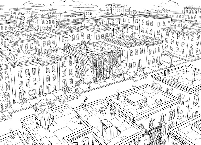
Establishing Shot - These set the scene for where the story is going to take place. They don't always have to have the main characters in, or be overly grand.
 |
| Establishing Shot |
Long Shot - These often place the character in scene and incorporates the whole body. Long shots are best used for action motions or moments of clarity.
 |
| Long Shot |
Mid Shot - Based on showing just the upper part of the body, often a natural or conversational shot.
 |
| Mid-Shot |
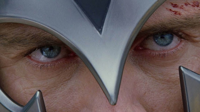
Close Up - These are emotional and intense, the closer to the subject, the more emotional. These don't always have to be on the face, they can focus on something that is important to the story.
Extreme Close Up - The same as close up but more intense, these shots will slow in and out to show tension.
Downwards Shot - Normally the POV of the character. A downwards shot gives the intentions of something more powerful looking down at the main protagonists and can bring the emotions vulnerability, threatening presence or foreshadowing.
 |
| Downwards Shot |
Up Shot - The same at the downwards but from the POV of the main characters, transferring power to what is being seen.
 |
| Upward Shot |
Over the Shoulder Shots - Associated with dialog, these shot places empathises on how characters react to each other, stopping the jarring motion of backwards and forth camera movements.
POV Shot - These are quite extreme and takes on the POV of the main protagonist. It brings the audience into the scene, the camera being the eyes.
Tilted Shot/ Dutch Angle - Strange and unsettling, these can show a warping sense of reality and emotion. These also bring in elements of danger.
 |
| Dutch Angle |
Composition
Objects that are locked into the corners of the screen gives stability but feel locked in. If using a mountain, placing it in a not so locked position can give the feeling of a world beyond the frame.
Asymmetry is also more natural rather then being symmetrical, giving a more natural feel to the composition. This is the same with Horizon Lines, placing it higher or lower changes the attraction to the eye.
 |
| Horizon Lines |
Tangents - These can make a scene messy by having too may lines intersecting. To avoid these, uses overlapping techniques.
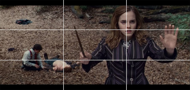
The Rule of Thirds - This grid help to create dynamic and powerful compositions, using the offset can create natural poses whilst bringing intensity to the foreground. This positioning also allows for the eye to explore events that are happening in the background.
Staging - Drawing the eye to the most import point of the shot, creating strong lines using other characters and the background elements.
 |
| Staging |
Contrast - Using silhouettes and tone can bring empathises to what is happening. Animation allows more freedom with character/object placements, contract and drawing the eye.
Acting Up - Storyboarding
Storyboards - These do not have to be complex, but have to be readable and convey what is happening.
Animation Layout - Shows how the camera and characters move though a scene. In these, it's important to think about the grounding. The Foreground can be used for framing and be more abstract, midground will have more details, whilst the background sets the scene. Making a clean outline of the environment can help with turnarounds.
Depth - Using light and shadow can bring emotions in the area, whilst showing what is important more forefront. With colour, muted ones will be seen in the background, whilst darker tones are more forefront. Using objects to frame a shot will bring the audience into the scene.
 |
| Depth |
Perspective involves using a horizon line and guide lines to draw in the eye and create interesting compositions. The higher the line, the bigger the ground area. The lower, the more items above eye line are in show. Perspective lines helps to bring in emotions, making a character feel empowered, threated or a changing sense of perception.
 |
| 1 Point Perception |
 |
| 2 Point Perspectives |


No comments:
Post a Comment
Note: Only a member of this blog may post a comment.