Tuesday, December 31, 2019

"The Shining" Film Review


Space Oddities Film Reviews

The Shining

(1980)


Figure.1
  Written by horror/suspense novelist, Stephen King, the basis of "The Shining" came when he was staying in a grande hotel in the mountains with his family.  Deeply inspired by Edgar Allens Poe's style of storytelling, "The Shining" is set around the deterioration of family ties and the destruction that addiction brings.  King makes many references to Poe's fable "The Masque of the Red Death", including characters identities, paraphrasing and location. Since the books release, not only has there been a film adaption (directed by Stanley Kubrick), but there are many comical paradies made from the axe scene. King released a sequel to "The Shining" called Doctor sleep in 2013, which follows Danny living though post-traumatic stress in his adult years prior the horrific events at "The Overlook" hotel. 
  
  To start this dramatic tale, after the lose of his previous teaching job, recovering alcoholic Jack goes to "The Overlook" hotel to have a job interview as a "Caretaker" for the closed months of winter. Being successful, the family proceed to move into the premises, also with the intention to give Jack the seclusion he needs to write his novel.  However, Wendy is warned by the current caretaker  Holloway, that the hotel can "twist" a weak mind, causing a previous attendant to kill their family in a psychotic  rage.  Wendy taking heed, she takes Danny and proceeds to support Jack in the role assigned to him.  As the weeks continue, Jack's attitude begins to change. He become brash, spiteful, even hysterical. He takes his foul mood out of his Wendy. she becomes fearful, remembering how Jack had broken Danny's arms in one of his drucken "punishments" before. Specters of twin young girls start to appear, haunting Danny and bringing visions of  blood filled corridors. During his exploration, Danny becomes enticed into a hotel room that was previously locked, returning catatonic and covered  in bruises all round his neck. His tellings of a strange women in the bath worries Wendy, and she sends Jack to investigate, only for him to become seduced by the ghoul. Over a period of the month, Jack falls back into alcoholism, whilst the whisperings of the previous caretaker tells him to be rid of the meddling outsiders. Holloway gets a feeling from his bedroom that something isn't right at the hotel, departing with a snowmobile to investigate.  Finally succumbing to the whispering of the ghosts, Jack loses his mentally and chases Danny and Wendy in a murderous rage.  Following the death of Holloway, the chase concluded in the maze, with Jack chasing Danny. Jack loses Danny's trail and become frozen, losing his life to hypothermia. Some month later, Jack is found frozen with a maniacal smile on his face.
Figure.2

  Jack (played by Jack Nicholson) starts as a regular down-on-his-luck guy, who is also in denial about his addiction problems. Perceived as once a brute and alcoholic, during his hallucination he is weak-willed in the sway of temptation. In taking on the job in pursuit of seclusion, he can also be seen as selfish. In desperate attempt to save from divorce, he uproots his whole family in pursuit of  saving his marriage but also in chasing his writing ambitions. In the periods of losing his sanity, the previous caretaker is often  present, he acts a mirror to Jacks inhibitions and accelerations his deterioration. The previous caretaker is a darker persona of Jack, and Nicholson plays the fall from sanity perfectly.


"When Jack thinks he is seeing other people, there is always a mirror present; he may be talking with himself" 
  R.Egbert - rogereburt.com

  Wendy comes across as quiet and withdrawn, with a downtrodden appearance. When Jack has his outbursts during his decent, she flinches ans steps away from his. She shows signs of previous abuse and is alway weary of what Jack could do. She doesn't trust her husband, and is quick to accuse him of hurting their son when bruises appear around his neck. Danny reflection of previous makes him vulnerable to the horrors hidden in the walls of the hotel, constantly seeing blood and spectres.  In moments of crucial reveal, Danny has the over exaggerated facial expression of shock/horror. these over-the-top faces have a dark-comic appeal. 


"The Overlook" hotel, both grand and vast is decorated in typical 80's style decor. Full of patterns that's clash against each other, the environment seems to stretch as Jack's mentals state declines. The lighting becomes colder, reflecting the harshness of isolation. The constant reminder of death is decorated though the blood rushing down the walls and elevator, the patterns of the interior are subtler in colour compared to the stark richness of the red. As the hotel is so bare, there isn't much sound, only the haunting echoes of footsteps and white static, bring the spense to be much higher. The isolation of the hotel is a reflection of unfulfillment to Jack. He is lost in life, haunted by his own actions and feels as hollow as the hallways around him.


"But the place is drenched in the memory of a violent past, and the horror and trauma rise inexorably to the surface." 
Figure.3
  P.Bradshaw - theguardian.com.

 As a whole this movie is the perfect representation of psychological stagnation, drawing on not only the unknown but terror of realism. The hotel itself the perfect set for revolution and pain. The  emptiness a constant reminder of Jacks violent tendencies, and how his dependency on alcohol changes him into a monster. Like many if Kings' fables, the hotel is based on a indian burial ground, adding that extra layer of unsurety. The hotel being surrounded by snow covered mountains makes thought of escape near impossible, unless a someone waa to come to their rescue.  Jacks final scene being found frozen months later with his unhinged smile gives that small element of dark humor, and the bathroom scene is often replicated in comedies. For a first time watch, this films underlying psychologies was interesting, but much of the talking scene was far too drawn out. 


"Alive with portent and symbolism, every frame of the film brims with Kubrick's genius for implying psychological purpose in setting: the hotel's tight, sinister labyrinth of corridors; its cold, sterile bathrooms; the lavish, illusionary ballroom"
  I.Nathen - empireonline.com


Bibliography

  • -Ebert, R. (2006). The Shining movie review & film summary (1980) | Roger Ebert. [online] Rogerebert.com. Available at: https://www.rogerebert.com/reviews/great-movie-the-shining-1980 [Accessed 31 Dec. 2019].
  • Bradshaw, P. (2012). The Shining – review. [online] the Guardian. Available at: https://www.theguardian.com/film/2012/nov/01/the-shining-review [Accessed 31 Dec. 2019].
  •  Nathen, I. (2012). The Shining. [online] Empire. Available at: https://www.empireonline.com/movies/reviews/shining-2-review/ [Accessed 31 Dec. 2019].

Image Bibliography

  • Figure.1 - Norris.D. (2018). Movie Poster Movement – The Shining - Horror Land - Horror Entertainment Articles and Videos. [online] Available at: https://www.horror.land/movie-poster-movement-the-shining/#gallery/a75ca398e6292db9a9978250c3ac6bd2/1061 [Accessed 31 Dec. 2019].
  • Figure.2 - Kaun, N. (2018). Movie Poster Movement – The Shining - Horror Land - Horror Entertainment Articles and Videos. [online] Horror Land - Horror Entertainment Articles and Videos. Available at: https://www.horror.land/movie-poster-movement-the-shining/#gallery/a75ca398e6292db9a9978250c3ac6bd2/1079 [Accessed 31 Dec. 2019].
  • Figure.3 - Hodge.T. (2018). Movie Poster Movement – The Shining - Horror Land - Horror Entertainment Articles and Videos. [online] Available at: https://www.horror.land/movie-poster-movement-the-shining/#gallery/a75ca398e6292db9a9978250c3ac6bd2/1089 [Accessed 31 Dec. 2019].

Thursday, December 12, 2019

"Who's Who" Jared and Chad Moldenhauer


Creators of MDHR Studio, Jared and Chad Moldenhauer designed and created the game "Cuphead" with a traditional "Golden Ear" aethstetic.

Jared and Chad Moldenhauer by Kimberley Davis on Scribd

Tuesday, December 10, 2019

Run Cycle Animation


    Although a little late, I have now done the run cycle animation. A full run cycle is 14 frames, 7 frames per step. Frames 6 is when the run is in mid-air, frames 4,5 and 6 are the propulsion points so the character moves forwards. Also, when landing, thinking about how the knee collapse and suspend for the next step.

My First Run Cycle

What If? Metropolis Reflective Statement


Reflective Statement


"What If? Metropolis" is the second part of the environment project. Using one of the "Invisible Cities" final outcomes, the goal was to create a 3D model of our chosen concept art. This means  involving furthering research, extending on current designs, planning matte paintings, then finally modelling, lighting and rendering in Maya. 

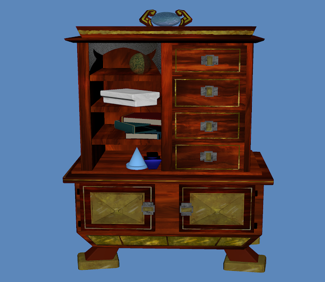
I decided on my internal concept as I felt this was the most interesting, giving the most challenge in design and modelling. When thinking about how I wanted my internal space to be perceived, it needed to feel lived in. The ambience to be warm and cosy, and like the tradesperson has just left the room for a moment, so it will be a bit messy. Firstly taking my original concept art, I used colour co-ordination to break the scene down into categories, these where Matte paintings, Hero Props and what would need to model in Maya. I wanted my vision of "Diomira" to have a oriental fashion, so my influence maps involved items from eastern periodic and modern eras. With the research complete, I used them to inspire my thumbnails and final orthographic designs. Although I didn't need orthographs for the more secondary items, drawing the thumbnails gave me a better understanding of their structure. Before using Maya, I started the basic matte paintings for the foreground and background in Photoshop. knowing my foreground objects (crates and bamboo barrel) would be darker, I tried to keep details minimal but they needed some texture otherwise they would have been bland. The back ground and walls was left plain until the final render was done, so to have a idea where to place the light and shadows to blend all the elements together. Taking these aspects, I went into Maya and modelled my Hero Props, some of the smaller items was created free hand. These other items are not meant to draw the eye too much, so the geometry didn't have to be so in-depth. Once all these was complete, I had to unwrap the UV's and place the painted textures. The textures where images I found online, used them as a faint base and then painted over the top to bring though a bit more of a rougher style. The crates where a painted individually. But, for the red wood, I painted the bench, then copied and manipulated them across to the table and cabinet. This technique was also done for the metal detailing, the golden top of the table was painted on rather then modelled. Doing the textures this way allowed to keep the style  and was much less time consuming. Now all the textures was done and the models re-wrapped, I could make a new Maya file and bring all the items together with the concept art as a guide. With everything was in place, lastly the scene required a few light sources. The main light was a Arnold Mesh Light to enable more intensity and exposure, for the background I placed some spot lights to act as flames for candles on the alter. Also, the main reading light had to have a source to illuminate the pages. Using a dimmer Area light for the doorway makes it seem as if the door has been left open slightly open. The lights have been given a more light yellow glow, to create a warm homely atmosphere. Now all the lights was set, I could use the shadows that Maya has created and work with them in Photoshop to define the Matte painting. Finally placing some highlights on the areas that are shiny (but I couldn't make reflective in Maya as they are painted), and darkening the "stuck on" foreground. The foreground Matte painting could be used in Maya due to transparency problem, so creating a wrap around the layer in photoshop removed the stuck on appearance.

This part of the environment project was quite a challenge. The research was fairly easy as I knew what I needed, and was able to draw the thumbnails quickly to capture my vision of the objects. However, moving into Maya was where there was the most difficulties. Having limited knowledge, I wasn't overly confident in creating the main light, cabinet and the paper-piles. Once I had finished the table and had some tutor discussions, it seemed their modelling come about much easier. But, at times I had gone a little overboard with bevelling, meaning it had added more geometry then needed. Unwrapping the UV's was also a issues, this was due to having too much geometry so finding the right place to makes cut caused problems and warped UV's. I had learnt from this in the later models, and the UV process was much better. Overall, I have enjoyed creating this scene, and feel I have learnt to be a bit more careful with my modelling in Maya. In the future, I want to improve on my confidence in my work and to do more painting and modelling tutorials exercises to gain this. 

What If? Metropolis Art Book and Presentation


       Art Book


    Presentation

Monday, December 9, 2019

What If? Metropolis - Final Scene and Pipeline


The final scene at present, I have managed to calm down the overly bright look of the foreground by placing a multiply overlay, and removing areas to create small highlights so they don't disappear completely. Also, I have placed light highlights on the more reflective areas on the scene so to bring a little more depth. 

Final Rendered Scene

Final Scene Progression GIF


Scene Pipeline

Life Drawing Session 5


  This session had longer periods, which gave more time to capture details. Overall, I managed 4 full body drawings, meaning I'm starting to get quicker and managed to keep some  figures fulling on the page.


Friday, December 6, 2019

What If? Metropolis - Rendered Scene and Photoshop


This is the progress of my Scene so far. There has been a lot of tweaking and playing about with lights, however I have struggled to get the Foreground Matte Painting into Maya. This means it looks a little different compared to the rest, so I may need to try an work on it to blend in better.


Thursday, December 5, 2019

What If? Metropolis - Setting the Scene


My progress so far in placing all the items together in one scene with the matte painting as a guide for lighting. It took me a while longer when i wanted to get all everything in the right place, and trying to understand the lighting was quite a challenge. There is a door way light which I wanted to make notable, but also some candles and lighting from the main lamp.  I also had to change some the specularity on some of the objects, they was much to shiny.

The next job is to create better shadows for the matte painting so everything fits together well.

Rendered without Matte Painting

With Matte Painting in place

What If? Metropolis - Finished Cabinet Textures (Lamp Creation and Improved Paper Piles)


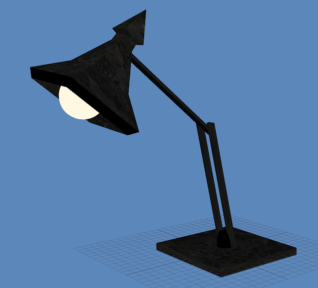
Finally, I have completed all my UV texturing for my models and have redone the paper piles as I wasn't happy with the last ones. Also, as this will be on a table, I made a quick lamp which will shine light down on a open book, hopefully adding more atmosphere to the scene.


completed Cabinet Textures
For the Lamp, I have followed a quick tutorial I have found online nut added my own design to it. For the light, I have chosen to use a spot light. This will give better control over the intensity and direction over the light-source.


Metal Textures to the lamp and chrome detailing (not shown here)


Improved Paper Piles

Tuesday, December 3, 2019

What If? Metropolis - Continued Model Textures (Books, Arches and Cabinet)


  Today I have completed the textures for the Arches/ Beams and the Books, and made good progress with the Cabinet. Once I have have finished these and made any changes needed, I can import them all in together with my Matte Painting and concentrate on the lighting,

Arches Textures


Book Textures using Aishaders

Progression so far on Cabinet


Monday, December 2, 2019

What If? Metropolis - Continued Model Textures 2 (Table, Light, Inkwells and Bags)


So far, I have painted and placed textures on the shipping bags and the table/ bench.  Also I have modified the textures on the inkwells, giving more of a moulded glass effect, and a more mottled appearance on the metal of the light. I feel the textures need some altering for these, and can do with some improvements. 

I may also re-do the sacks, the are much too dark and so seem to have much in the way of style. 

Brown Shipping Bags

Table and Bench Textured

Front view

Light Texturing

Update Inkwell Textures

Inkwells Rendered

Saturday, November 30, 2019

What If? Metropolis - Ink Pots Textures


The current Progress with the Ink Pots, these was done using the presets on the AiStandardSurface (Chrome and frosted glass). I didn't want it to be overly shiny, so I increased the roughness. The second one gave me a little trouble as it was all modelled from one polygon., and this took a lot longer then hoped. I;m not sure if ill keep them like this, but it was good for experimentation.


What If?Metropolis - Crate Textures and UV's


Moving into adding textures to my models, I started with the Crates. Firstly placing a AiStandardShader with block colours, then moving my UV maps into Photoshop. Once changing the UV's to screen mode, I placed a rough wood texture on Overlay, and used a rough textured brush to make the details. when it came to the second crate, already having textures meant I could copy parts and manipulate them to have a different appearance.


1st Crate with Textures

1st Crate with Block Shaders

2nd Crate with Textures
Both Crates Textured


Crate 1 Main body UV


Crate 1 Frame - Dark Wood

Crate 1 Dark wood Texture

Crate 1 Light Wood Texture


Crate 2 Dark wood frame UV's

Crate 2 Panels UV's

Crate 2 Panels Textures

Friday, November 29, 2019

What If? Metropolis - Continued Models


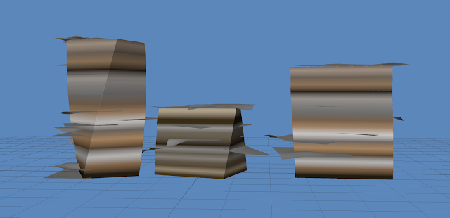
Coming to the last of the modelling for the internal environment, I have completed the Hero Props of the Cabinet, Table (and Bench) and the light. Also, I have modelled some other items, these are not going to have UV's but will just have AiSurfaceShaders. These items will be placed around the room, duplicated and transformed slightly. I have made inkwells, paper piles (Although I'm not overly happy with these), arches, books and brown shipping bags. There may be another smaller lamp to add, but this comes down to time. There is still the completion of the matte Painting and lighting to consider. I now have to set the UV's, sort any out that are wrong and think about transferring into photoshop for texturing. 

Cabinet (Hero Prop)

Cabinet (Hero Prop)

Table (Hero Prop)
Table and Bench (Hero Prop)

Arches (these can be transformed to fit the Matte Painting)
Shipping Bags (May be painted)

Shipping Bags
Books (one open and closed)

Books

Ink Wells

Paper Piles (I may redo these)

Major - Submission Post: Final Animation, Reflective Statement and Links

Final Reflective Statement When starting the Major Project, there was still quite a lot of work left over from Minor for the planned final...